
Head-to-toe prints were one of the most prominent prowlers on the fall ready-to-wear catwalks. Designers incorporated bold florals, abstract prints, and geometric patterns, all while having fun mixing and matching. While you might write off print mixing as too busy or complicated for you, there are an endless variety of ways to work pattern into your wardrobe this season.
Before I get into 4 personalized, guesswork-free tips (you’ve never heard before), I want to touch on a few well-known pieces of print mixing advice. If you Google “how to mix prints”, you’ll find these principles covered in nearly every article out there. In case this is the first time you’re researching this topic, let’s quickly cover these basics…
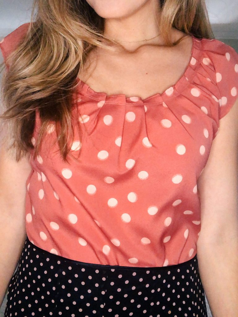
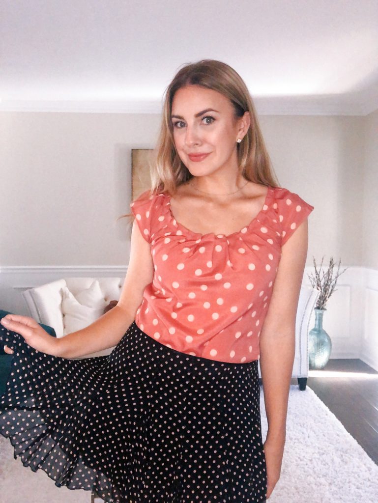
- Lace, stripes, polka dots, and leopard prints are generally considered neutrals. These patterns almost always pair effortlessly with everything.
- Coordinate your colors when mixing prints. Opt for patterns that have a similar color scheme or accent hue.
- Balance the scale of your patterns by wearing a small, understated print in combination with one that’s larger and bolder.
- Confidence is key. Mixing prints is a surefire way to stand out. So before you leave the house, the most important thing is to make sure you feel good about your ensemble and prepared to accept a flood of compliments and attention.
Now that we’ve gotten the widely adopted guidelines out of the way, let’s talk about 4 more personalized ways to mix prints like a pro, without the guesswork.
1. Stick To Your Style
When it comes to getting dressed, where we get tripped up the most is trying to emulate someone else’s style instead of our own. Head to any social media platform or style blog and you’re sure to find print mixing outfit ideas to last a lifetime. Knowing your primary style type(s) will help you choose print combinations and learn how to style them in ways that align with who you are and the authentic impression you want to make.
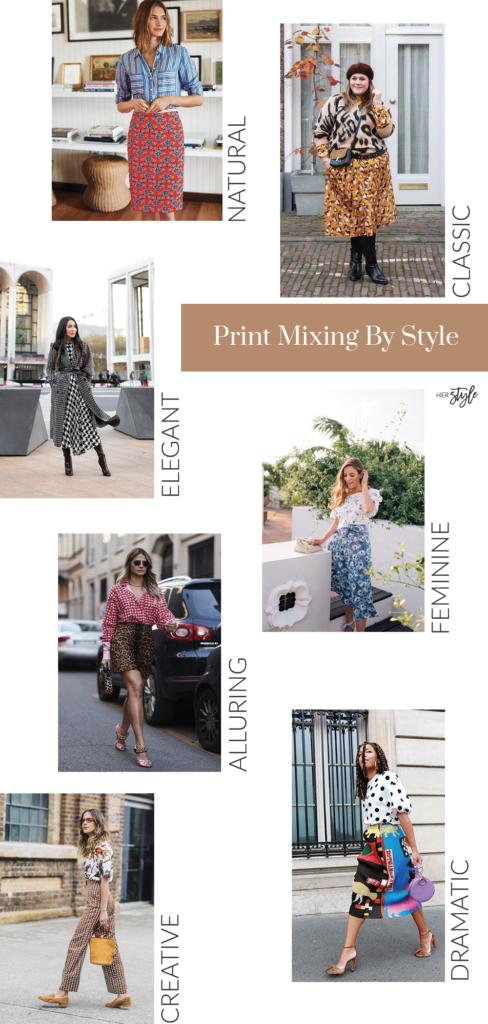
If your style is natural or classic, for example, opt for understated patterns like neutral stripes, plaid and herringbone, or basic color blocking. If you get major feels for all things feminine, focus on florals, lace patterns, and delicate polka dots. Dramatic and creative style types can enjoy more of a wildcard mix. At the end of the day, the patterns you wear should always be as subtle or standout as is comfortable for you.
Here are a few (Pinterest sourced) print combo examples for the 7 universal style types:
If you’re feeling iffy about your signature style, pause right here and take my free 5-minute personal style quiz for all the clarity you need.
2. Play Within Your Personal Color Palette
A lot of stylists will tell you the most foolproof way to mix and match prints is by sticking to a simple black and white color scheme. While this definitely a safe strategy, it’s not guaranteed to be the most flattering. Black and white is a high contrast pair and if your personal colors are softer or closer together in value, you could be easily overpowered by achromatic prints.
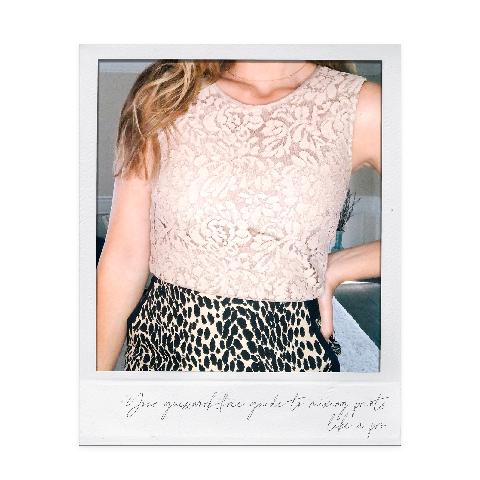
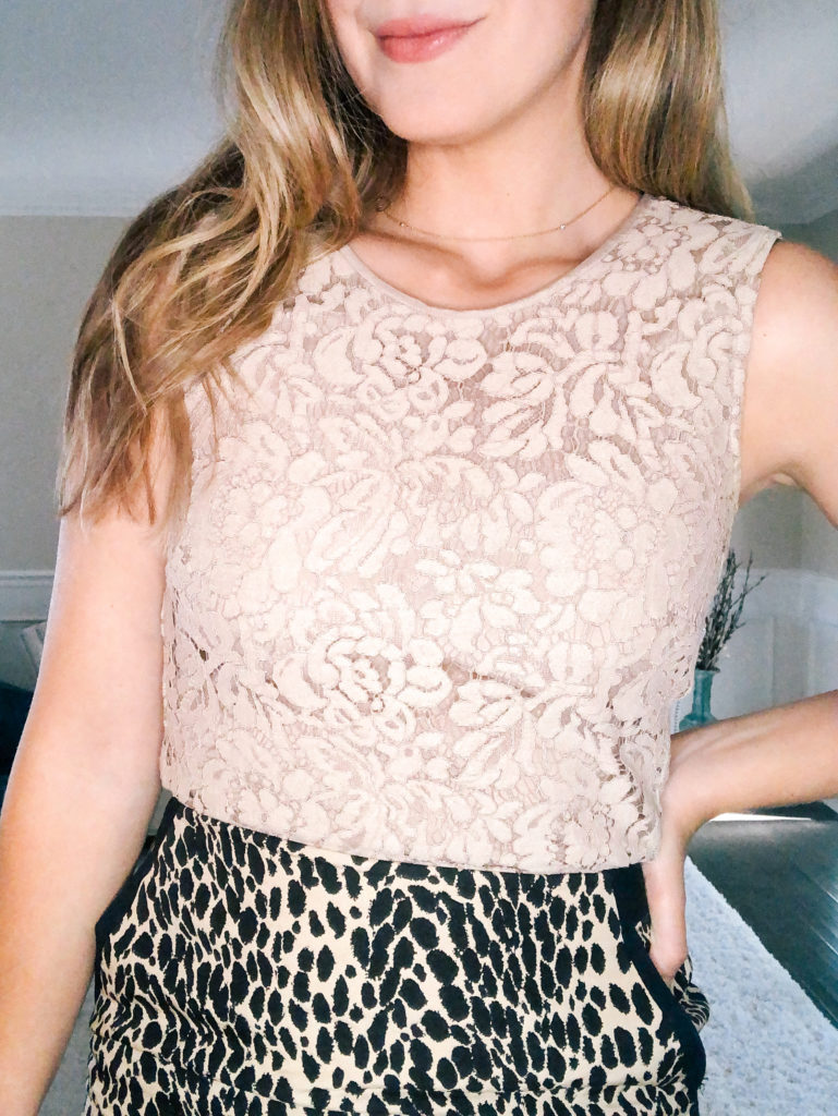
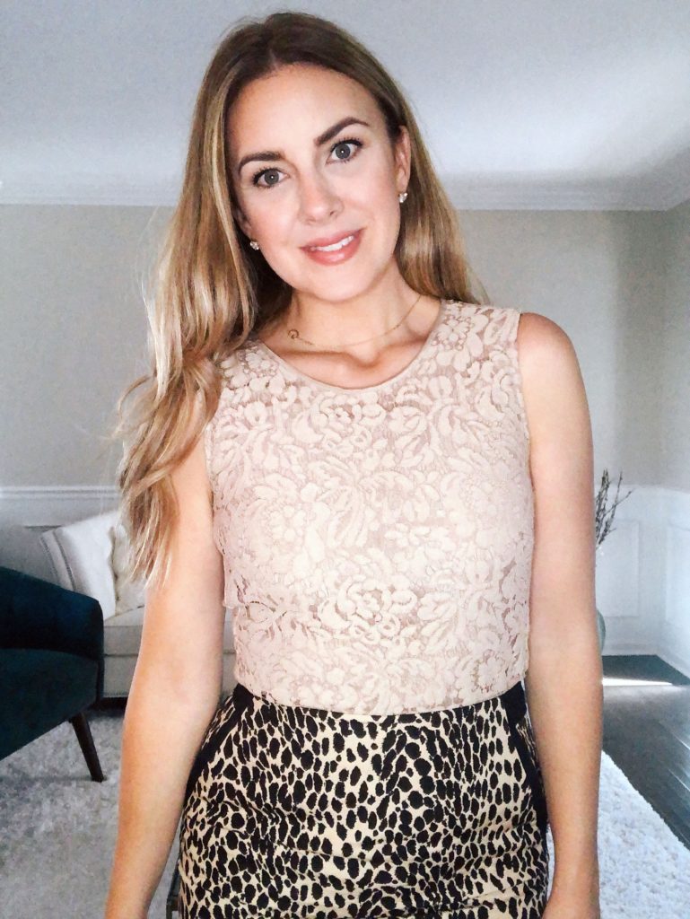
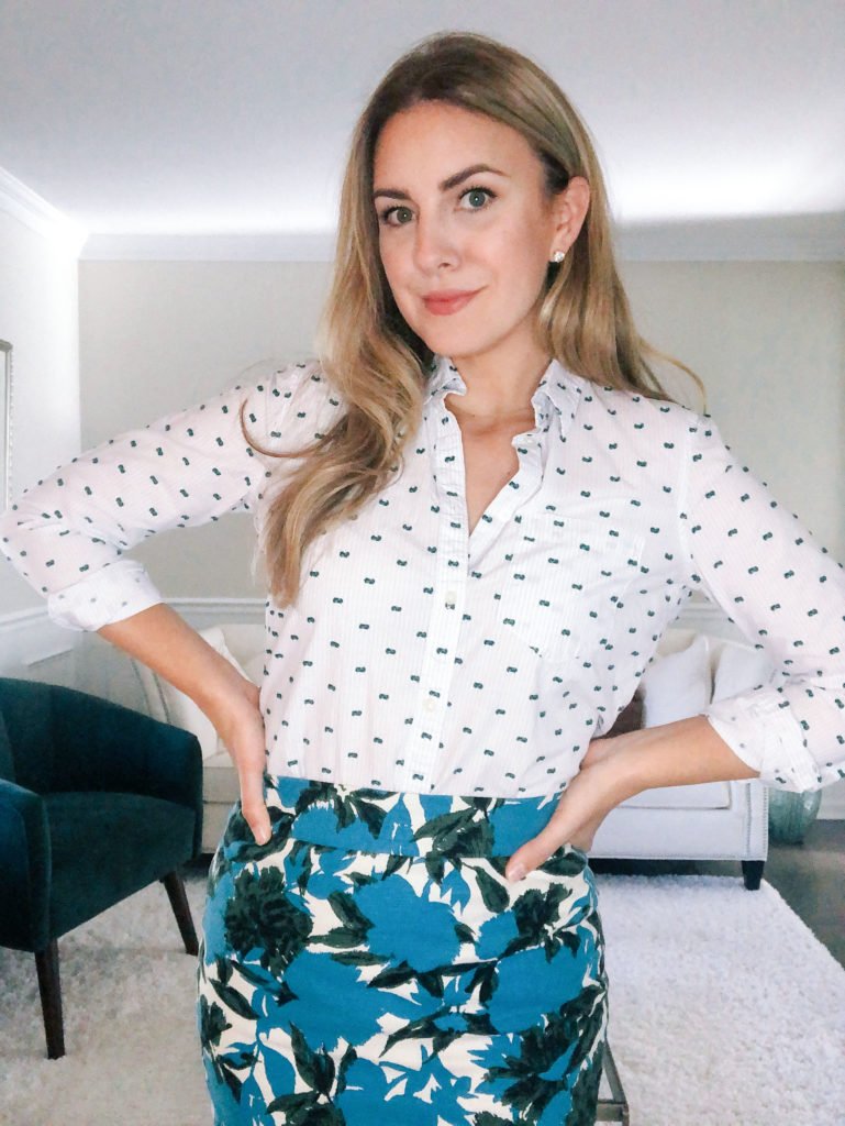
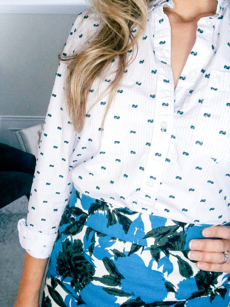
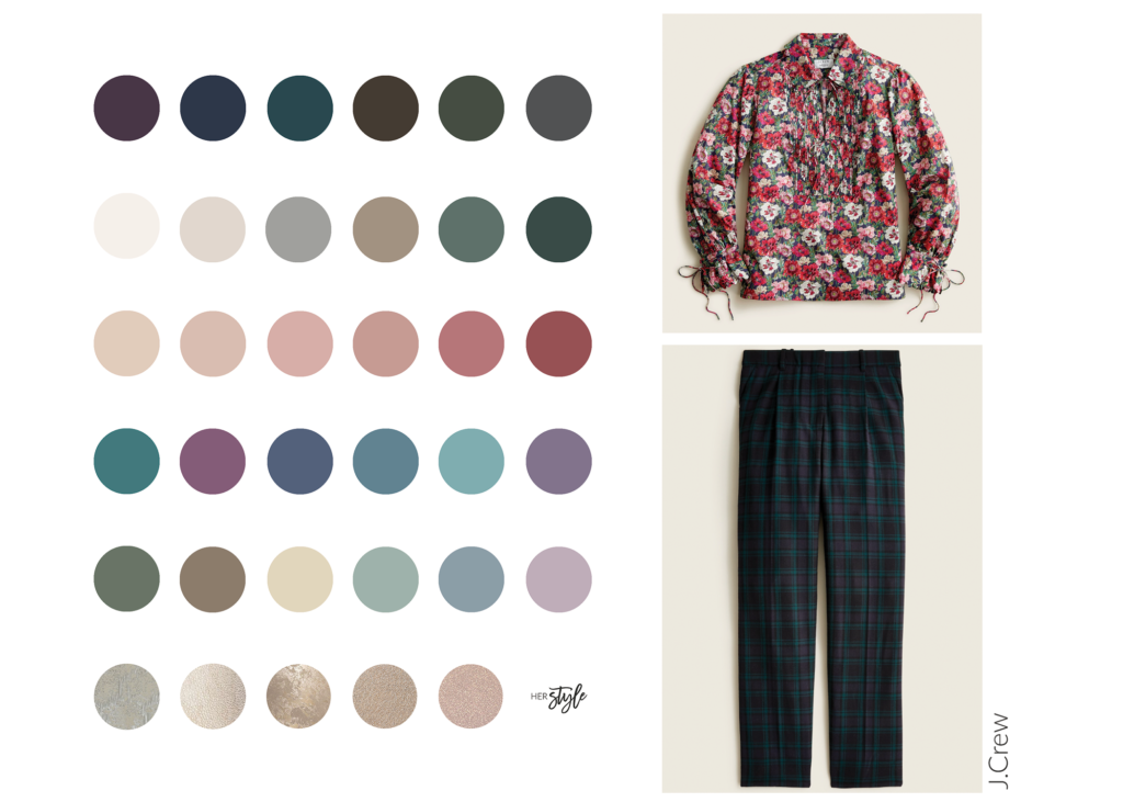
Instead, I highly recommend investing in your own personal color palette as a guide to your very best colors for clothing, cosmetics, accessories, and of course, prints! Your custom palette will be in harmony, meaning all of the colors within it coordinate effortlessly. As long as you opt for patterns in a combination of these hues, they’re much more apt to look amazing, both with each other and on you. Here’s a quick print pairing I came up with based on my own personal color palette and the latest J.Crew collection:
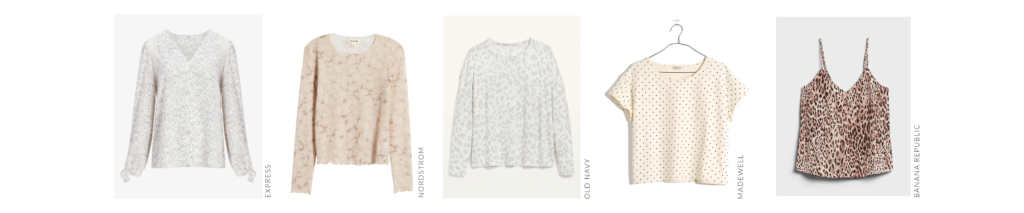
BONUS TIP: Neutral prints pair naturally with other neutrals and more colorful patterns. So they’re a great option to have on hand until you feel brave enough to try more complicated mixing and matching!
3. Flatter Your Figure
If you’ve binged my other posts and I’m starting to sound like a broken record about the importance of flattering your figure… GOOD! I feel like this isn’t something that’s emphasized enough in our influencer, TikTok trend, and style-obsessed culture.
I’m all for taking cues and inspiration from our fashion icons. But the cost of wearing something ill flattering for the sake of a trend is simply not worth it. So instead of blindly copying whichever print combos make you slow your scroll, take a pause and think about how these two key aspects apply to your beautiful body:
- SCALE: Did you know your most flattering print sizes relate to the scale of your facial features? If you’re blessed with stunningly large eyes or delicate lips, take that into consideration when choosing the patterns you wear. The last thing you want to do is let your gentle features get lost against an oversized print or vice versa. Remember that the art of dressing well is all about working with your body’s inherent design.
- LINE DIRECTION + PLACEMENT: The other factor to consider is whether a pattern’s line direction and placement will be flattering on your frame. As a general rule, horizontal lines tend to create a widening effect, whereas vertical lines narrow. Diagonal lines can be strategically placed to break up spaces you want to minimize. Make sure your prints draw the eye away from areas you want to downplay and toward your favorite features. If you’re not sure how these concepts apply in real life, just take a look at the fit model images before you buy. Notice where your eye is naturally drawn. Is that an aspect of your body you want to highlight? It takes a bit of practice but try to let the overall direction and placement of your prints bring out your very best.
4. Basic Design Principles
When it comes to choosing the perfect print combinations for you, keep in mind the following three basic design principles:
1. BALANCE – the way visual elements are arranged so their weight harmonizes with the other elements in your outfit and creates ideal distribution.
2. REPETITION – reusing the same or similar elements throughout your ensemble to create unity and visual interest.
3. HARMONY – creating cohesiveness between you and your outfit. I always want YOU to wear your clothes, rather than your clothes wearing (or overpowering) you.
Since I already mentioned the key to wearing the right prints is mirroring the patterns in your pretty face, let’s look at how you can apply these principles when picking your prints.
How much space is there between your eyes, nose, and mouth? ➟ Balance this with the background in your patterns.
Consider whether the lines in your eyebrows, eyes, nose, and mouth are curved or straight. ➟ Repeat that movement in your prints.
Are the edges of your facial features very clearly pronounced, more undefined, or somewhere in between? ➟ Create visual harmony with a similar print definition.
Choosing the right print combinations goes a long way.
I hope this post has given you inspiration for daysss on how to select the best patterns to compliment your signature style, personal coloring, and inherent features. It’s not just about opting for the trendiest #ootd or following the print mixing rules you’ve heard before. Don’t underestimate the importance of applying these personalized tips and making every look you wear work for you.
Use common sense (like remembering that horizontal stripes will widen your appearance) and choose prints that flatter either the curvature or angularity of your features as well as your overall taste and style. Have some fun playing around with patterns! They’re a great way to express yourself and spice up your wardrobe.
Let’s continue the conversation, as always. Drop a comment and let me know your go-to print combination OR which pair you’re feeling inspired to try first!